Our experienced and well-versed team consists of graphic designers, front-end/back-end + full-stack developers, digital marketing strategists, copywriters & content creators, SEO and PPC specialists that work in harmony under the direction of the founders of our web development and web design agency in Toronto.
Although web design and web development are different, our team is well-trained and equipped to do both. First and foremost we design a user-friendly, aesthetically pleasing, effective, on-brand front end. While also creating highly functional back-end systems to not only help business owners maintain their own websites but also potentially integrate with many other online and retail systems and software applications. We are dedicated to providing you with forward thinking web design and web development services and a customer service experience that you will be very happy with.
Website Development and Website Design are two terms that are often interchangeable. But what many people are unaware of is that these two services are actually fundamentally different when it comes to building a website. You’re probably wondering what exactly is the difference between the two. There’s a reason our web design agency prefers creating custom websites from scratch. With most projects, we usually implement both website design and website development techniques, so it’s important for potential clients to understand the difference between the two.
Website Design
Web design involves the graphical look and feel of a website, the layouts - where everything is placed, the colour themes, the graphics and images, the font type and size for the textual content, and anything else related to the visitor’s experience and interaction with the site from a visual perspective. Our creative and proficient design team will always provide you with a unique design that stands out. You won't have to worry about blending in with your competitors.
Website Development
In order to bring the website designs to life, our team of expert web developers will program them (via software applications or coding languages) so that users can properly interact with and use the programmed website. We want to see your business succeed! Regardless of the type of business you own, you will need a fully functioning website in order for people to use it properly so that it can benefit your organization.
Quick Intelligence is a leading cybersecurity company, offering MSSP, vCISO, AI security services combined with intelligent detection, compliance support, and strategic guidance with a refreshingly calm user experience.
EcoComfort Insulators are attic insulation experts, serving the Greater Toronto Area, offering a wide range of attic & roof services. EcoComfort creates efficient, healthy, & worry-free attics!
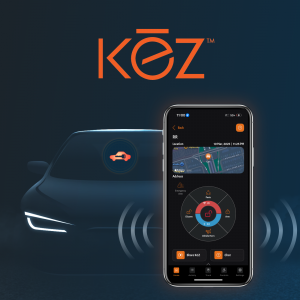
KEZ/Keyfree Technologies Inc. is a Toronto-based automotive security and technology company dedicated to preventing vehicle theft before it happens. With over 1,000,000 vehicle thefts every year across North America, our mission is clear: deliver advanced, reliable vehicle protection that is accessible to every driver.
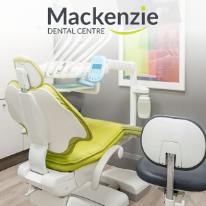
Mackenzie Dental Centre is powered by an entire team of dental professionals, from assistants and hygienists to dentists, to bring the community the highest quality of care. Dr. Lloyd Pedvis is a leading dentist with decades of experience providing patients with high-level dental solutions and care.
Apex Auto Transport offers more than just car shipping. Their knowledge base ventures beyond all aspects of transportation services. They have years of experience in the trucking industry so feel free to let us know whatever it is you need shipped.
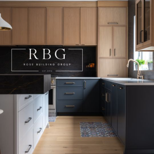
Rose Building Group is a renovation company based out of Burlington, Ontario. We work hard to bring quality renovations to the homes of families in Burlington, Oakville, Hamilton, and surrounding areas of Ontario. The professional team of home renovation contractors specialize in basements, bathrooms, kitchens, and full home renovations.
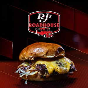
In 2023, Chef Jared Wagman and Ryan Silver established RJ’s Roadhouse with the goal of revolutionizing the sector they held in high regard. Best friends Jared and Ryan started off as event cooks at the Enercare Center.
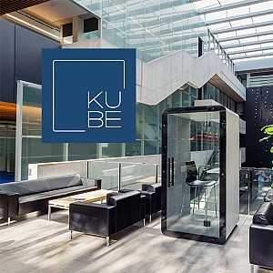
Kubebooth products work by reducing noise (36dB) and distractions in the office, ultimately fostering a private space where productivity and efficiency can flourish. To date, they have helped scores of clients in every sector of the economy navigate a sustainable course through the fast-paced emerging global marketplace where flexibility is not just an attribute, it’s an absolute necessity.
Established in 2010, IGBeauty is a premium Cosmetology and Laser Clinic in Toronto. IGBeauty offers a complete collection of effective cosmetic, therapeutic and laser treatments, providing solutions for skin conditions and aesthetic enhancements.
Family owned & operated for over 40 years, Canadiana Flowers is committed to providing the customers with the finest floral products, backed with fast, friendly and professional service.
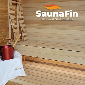
SaunaFin is North America’s largest and most trusted retailer of all things sauna. Along with thousands of residential saunas, SaunaFin has supplied saunas and steam baths in some of the most renowned locations around in Canada and the United States, from the Palazzo Hotel Casino and M Resort Casino in Las Vegas to the Rogers Centre, Casino Rama, Casino Windsor and many more.
Join Canada's #1 natural weight loss clinics to burn fat, lose weight and boost your metabolism for life. Simply, delicious, hormonally balanced and personal care - you can lose weight at any stage and any age.
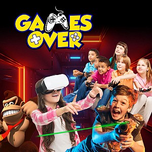
GAMES OVER provides the ultimate no stress – no mess event entertainment experience! We will make your birthday party special or your event the most talked about, whether for a kid, or for kids at heart.
At Art of Smile Dentistry, Dr. Hermina Battaglin and her dedicated team are committed to providing exceptional dental care in a comfortable, stress-free environment. Our practice offers a wide range of preventive, general, and cosmetic dental services tailored to your unique needs.
WYZDOM Technologies, was established in 2008 as an international technology integrator, security consulting, expert witness, and digital infrastructure support organization.
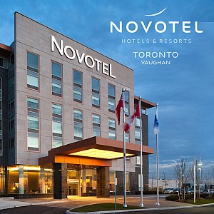
Ideally located on the Northern edge of Toronto, Hotel Novotel Toronto Vaughan provides a contemporary destination for business and leisure travelers. Offering modern accommodations and a highly accessible location, our Toronto Ontario hotel features 149 rooms.